Contract Work
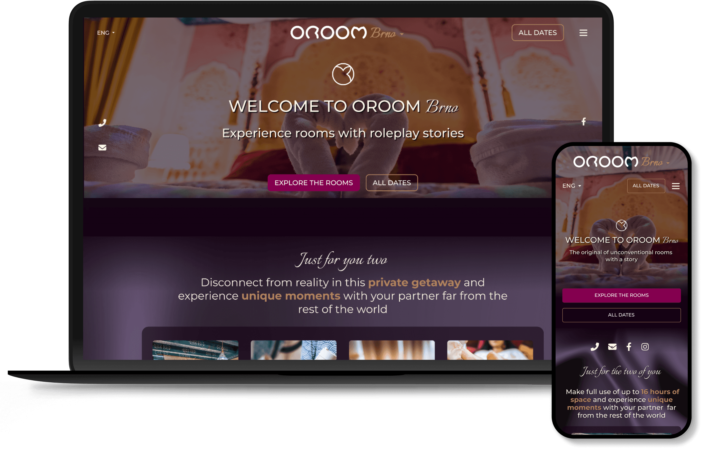
Responsive Website
User Research
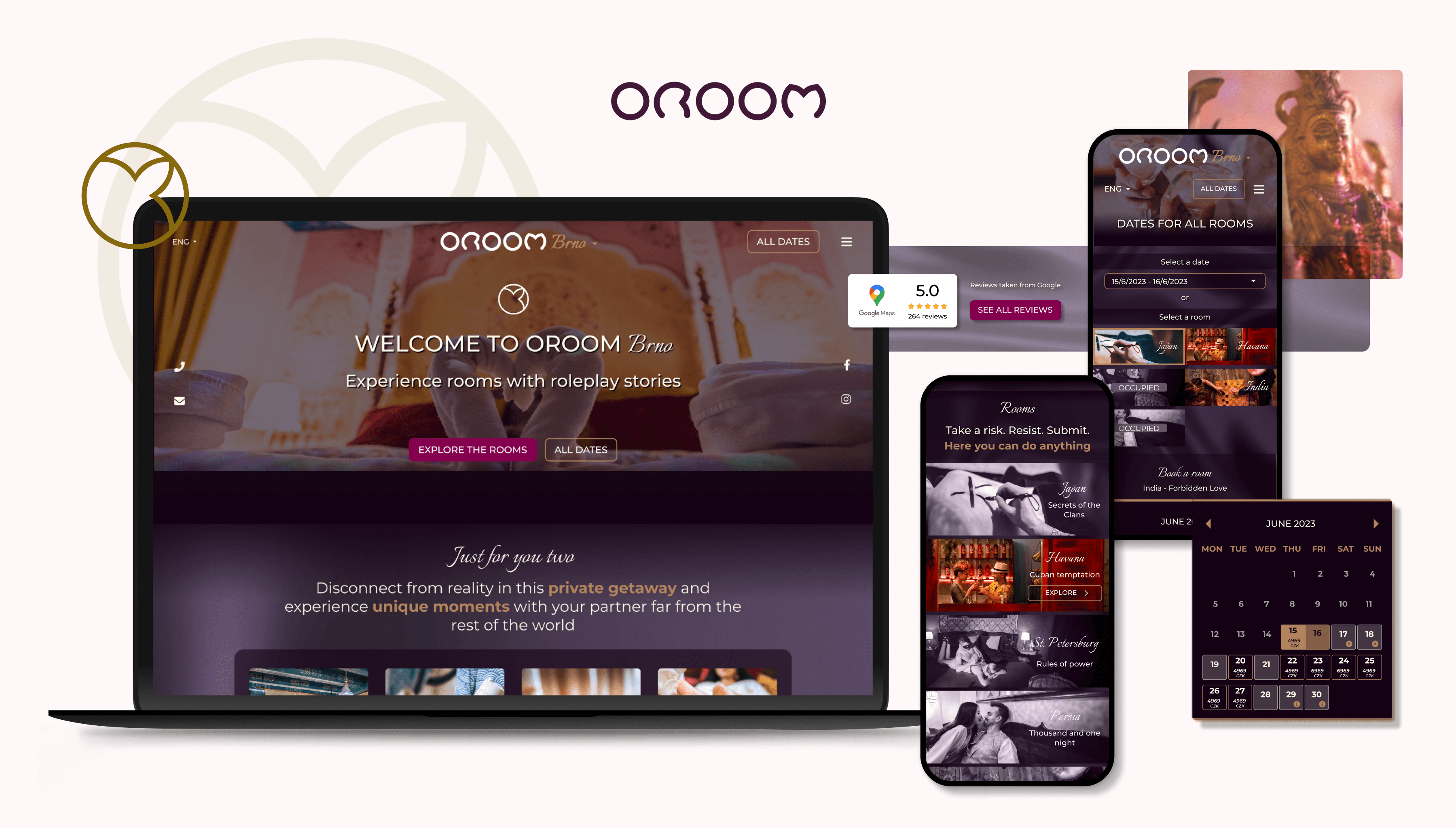
RESponsibilities /
Contract UX/UI Designer
UX Research
Website Audit
Interaction & Visual Design
Implementation with Development
team /
CEO
Developers
Marketing Team (Paid Media, Account Manager, Copywriter)
Customer Service
quick links /
Wireframes
Final Designs
Live Website
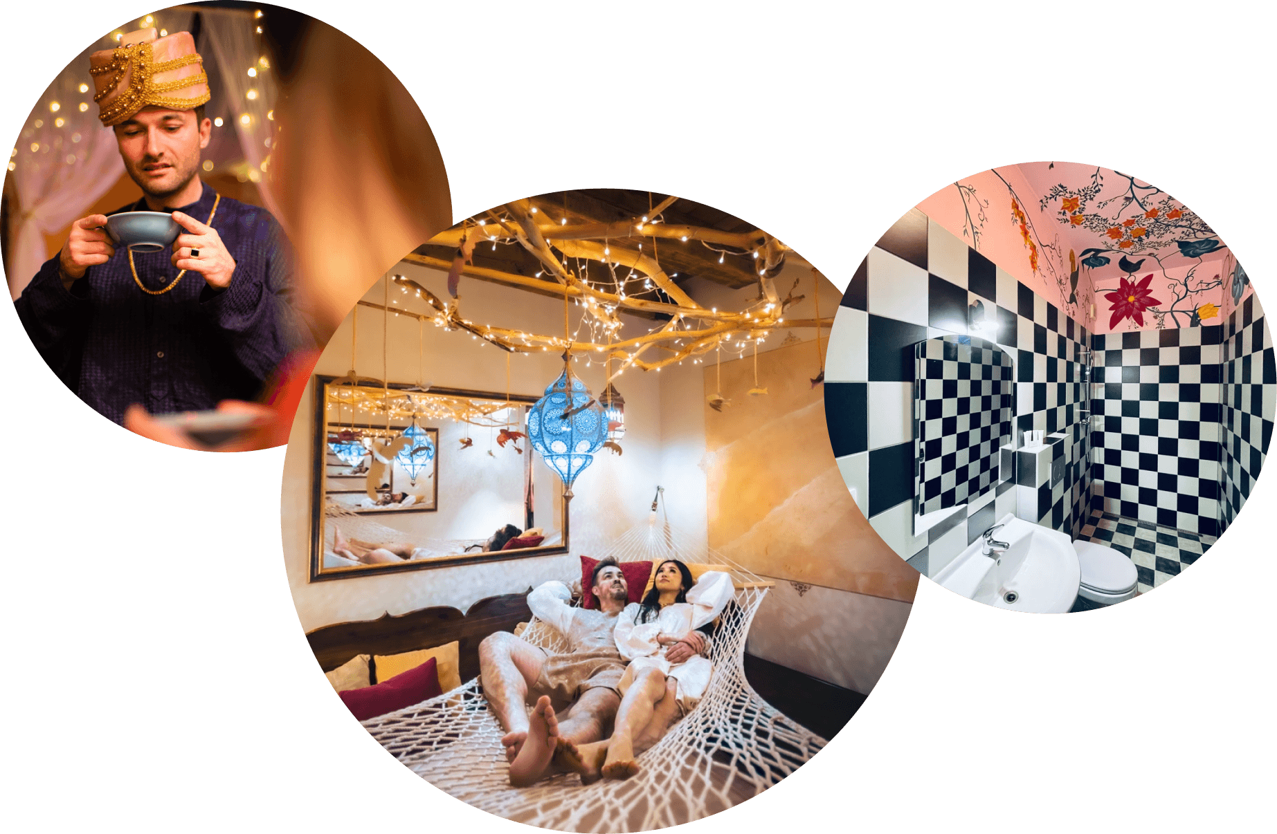
Imagine booking a room that takes you to another world—a night in India or Japan with role-play stories, costumes, and the privacy to escape everyday life.
Yet OROOM’s website wasn’t telling this story. It struggled to capture this magic, leaving potential customers confused and disengaged. That’s where I came in.
Disclaimer: All views expressed here are my own and do not necessarily reflect the views of the respective company.

the problem /
weak value presentation and low engagement
The website did not clearly and effectively present its unique service, leaving visitors confused and missing critical opportunities to engage them from the outset. Without a strong presentation of the service's qualities, it was perceived as adult services and too overpriced.
Conversion Rate
0.25%
*calculated with limitations due to Cookie consent restrictions
Bounce rate
~90%
*slightly different on each page
business goals /
strategic objectives of the redesign
01 / Enhance website clarity
Clearly and effectively present the unique service offerings, addressing the previous issues of weak communication.
02 / Improve Engagement
Develop a more engaging website to capture and retain visitors, reduce bounce rates, and boost client interaction.
03 / increase Conversion Rate
Increase the conversion rate from 0.25% by optimizing the user journey, booking experience, service value presentation, and overall site usability.
04 / Strengthen User Retention
Convert new visitors into returning customers, moving beyond just attracting traffic to fostering lasting relationships with clients.
project Kickoff /
Convincing Leadership of the Need for UX Research and Redesign
The original and redesigned versions of OROOM's website were created without UX research or user testing. Recognizing this gap, I reached out to OROOM and presented a compelling case for a website overhaul and it's possible benefits. By presenting research results and data, I convinced the leadership of the need for a redesign, which led to a more engaging and user-friendly website.
my ROLE /
Introducing UX Practices, integrating Effective UI and leading implementation
Later, as the first UX/UI designer on the OROOM team, I conducted OROOM’s first structured customer interviews and website testing to guide the redesign, presenting insights to the leadership team and outlining customer expectations and hesitations regarding their unique service offerings.
I collaborated with cross-functional teams and led the implementation of design changes across various website versions and 2 language variations (Czech & English).
solution /
grow trustworthiness and support and communicate service value
The result was a more engaging and understandable website that better communicated the value of OROOM’s unique offerings, aimed at reducing bounce rates and boosting customer retention.
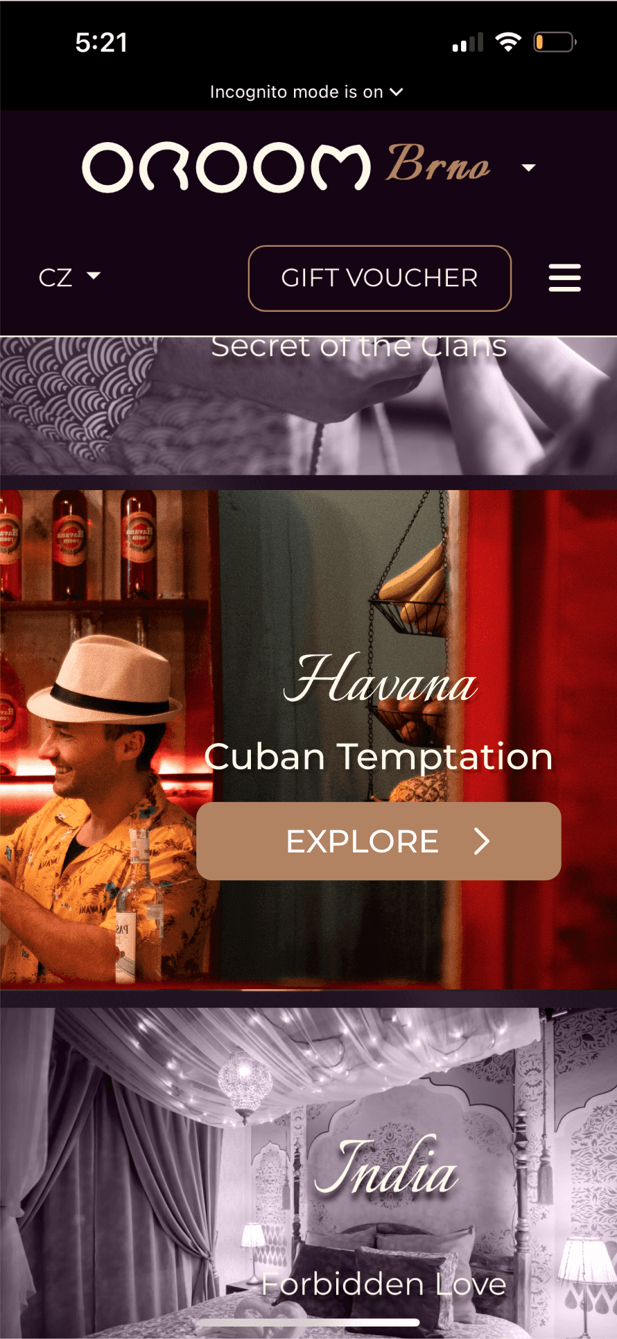
homepage BEfore
No explanation of the service itself.
Inconsistent video sizes versus room sections without video.
Scroll to explore
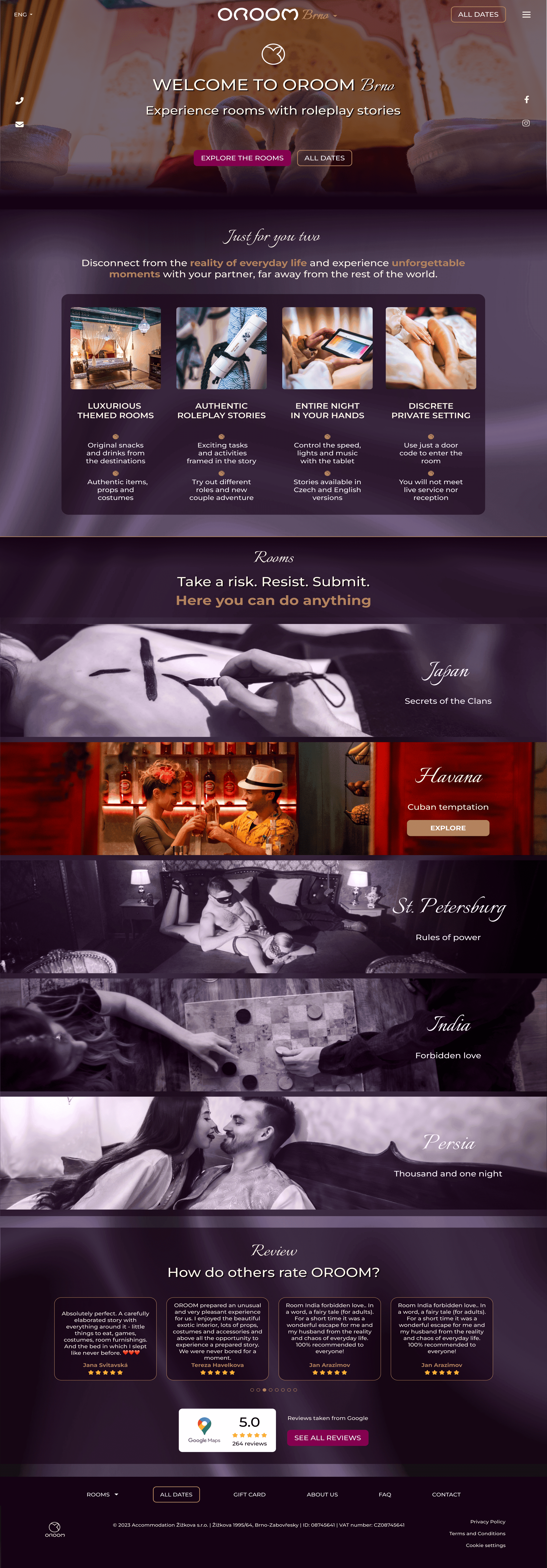
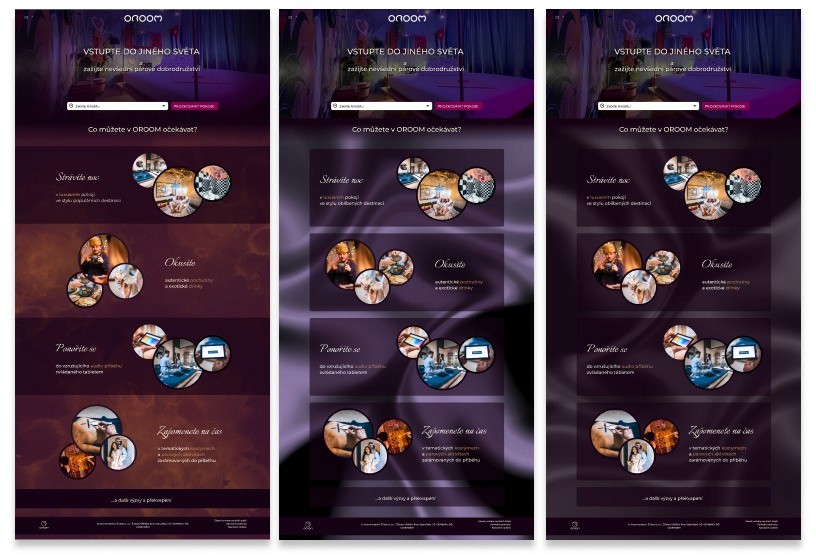
homepage After
Structured visually supporting presentation of the unique service.
Consistent interactive room list.
Scroll to explore
Scroll to explore

Scroll to explore

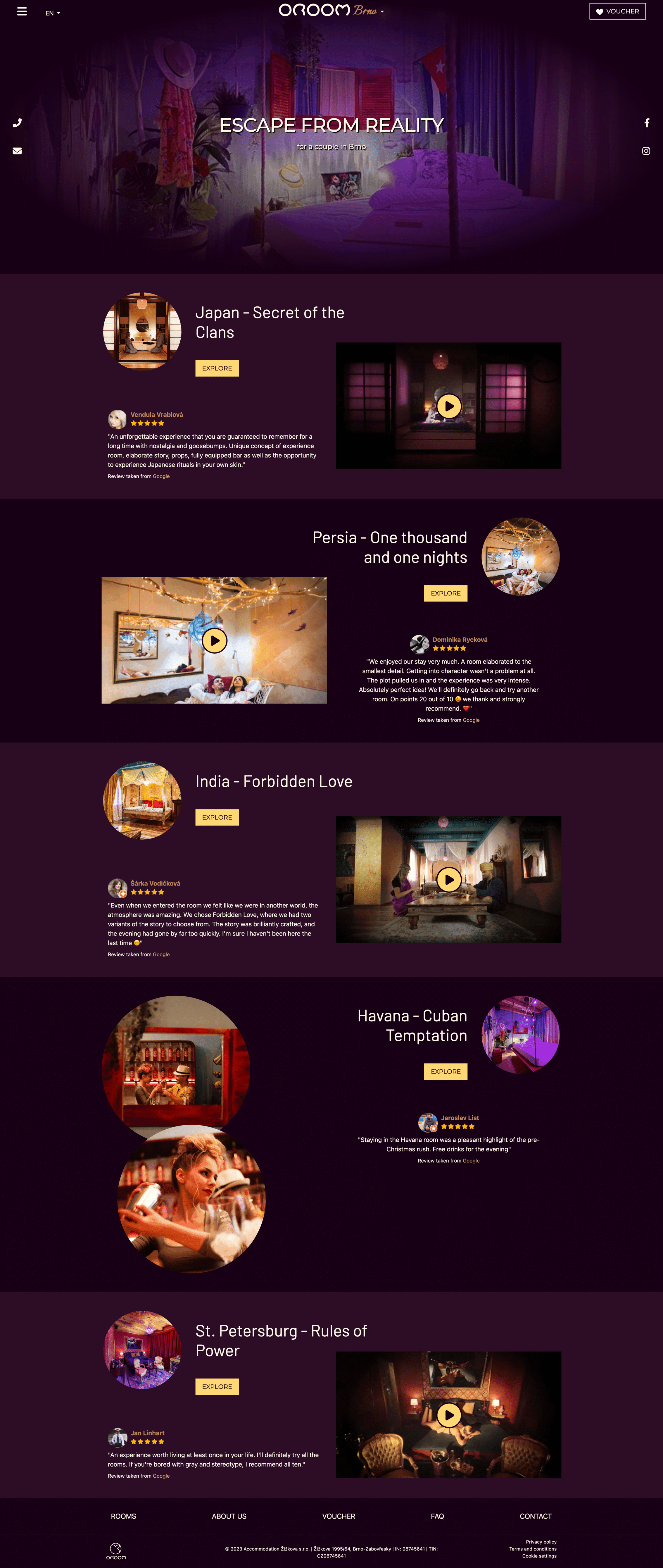
room page BEfore
No description of the room or the service, only a long list of included items.
Large, unstructured, and repetitive photos.
Calendar positioned too low without a clear call-to-action leading to it.
Scroll to explore
room page After
Significantly shortened the page length by logically grouping key information and photos.
Added prominent calls-to-actions throughout the page.
Introduced a review section for each room.
Scroll to explore
Scroll to explore

Scroll to explore

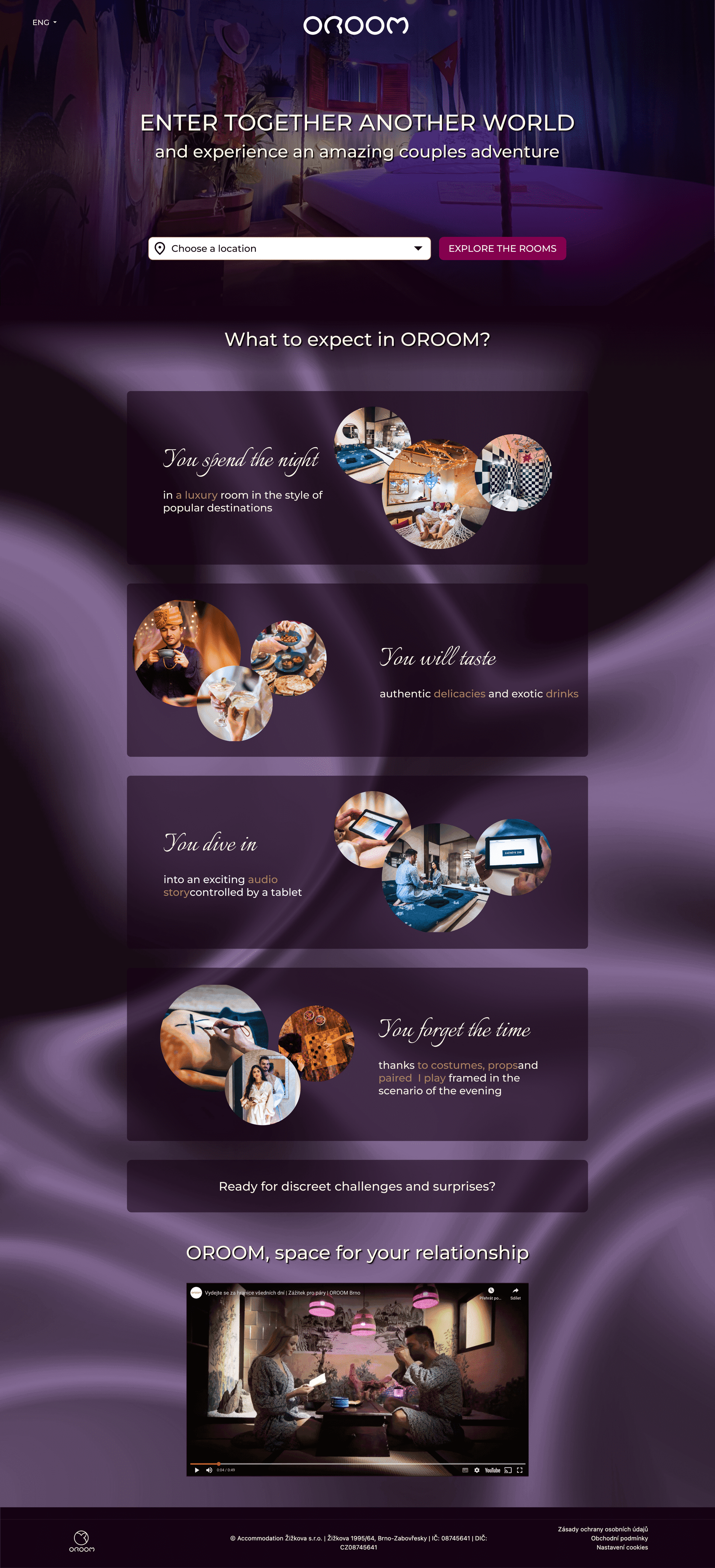
newly created pages during redesign
Wayfinder
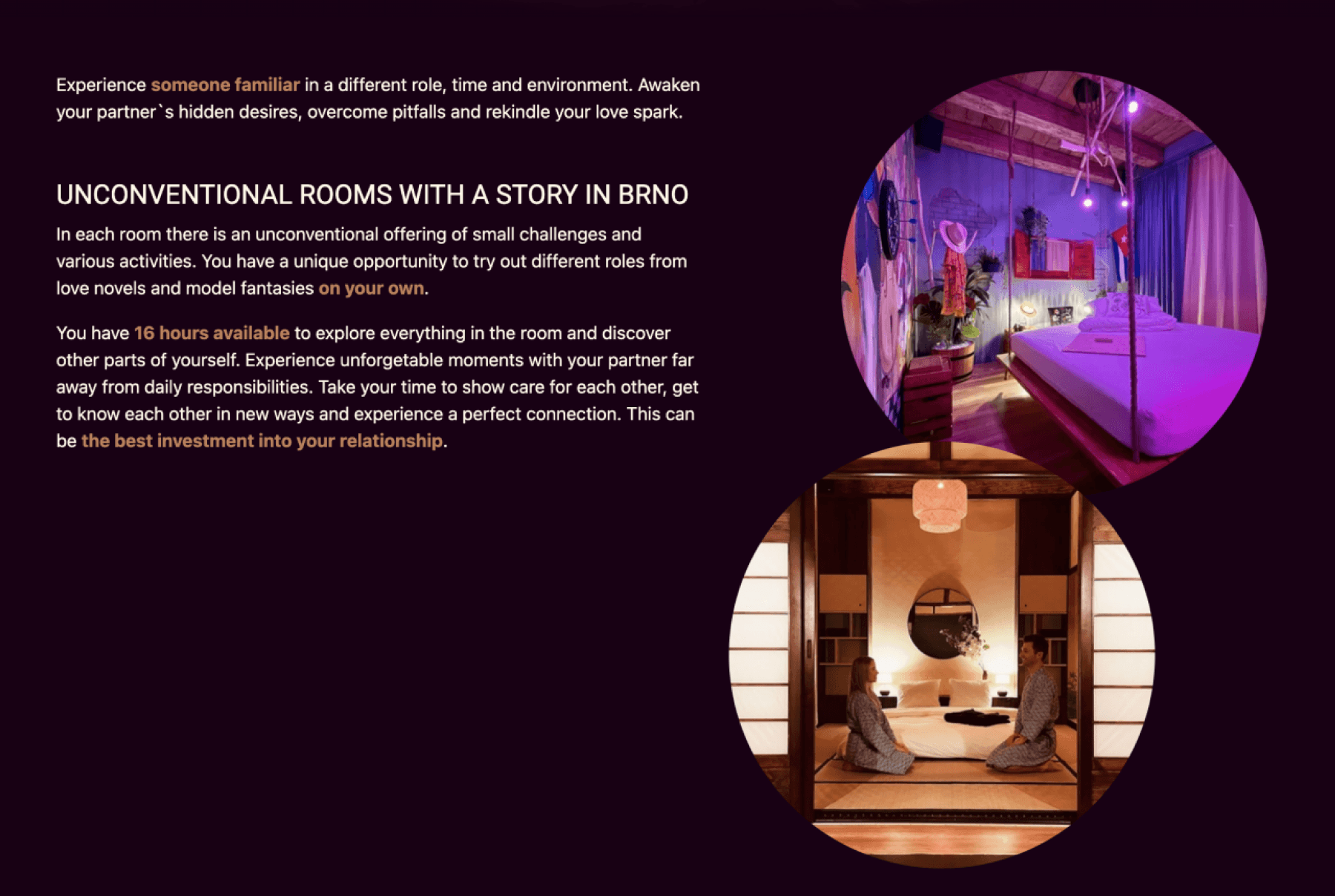
During the time of the redesign new locations for OROOM were opening and a general wayfinder had to be created.
Scroll to explore
Scroll to explore

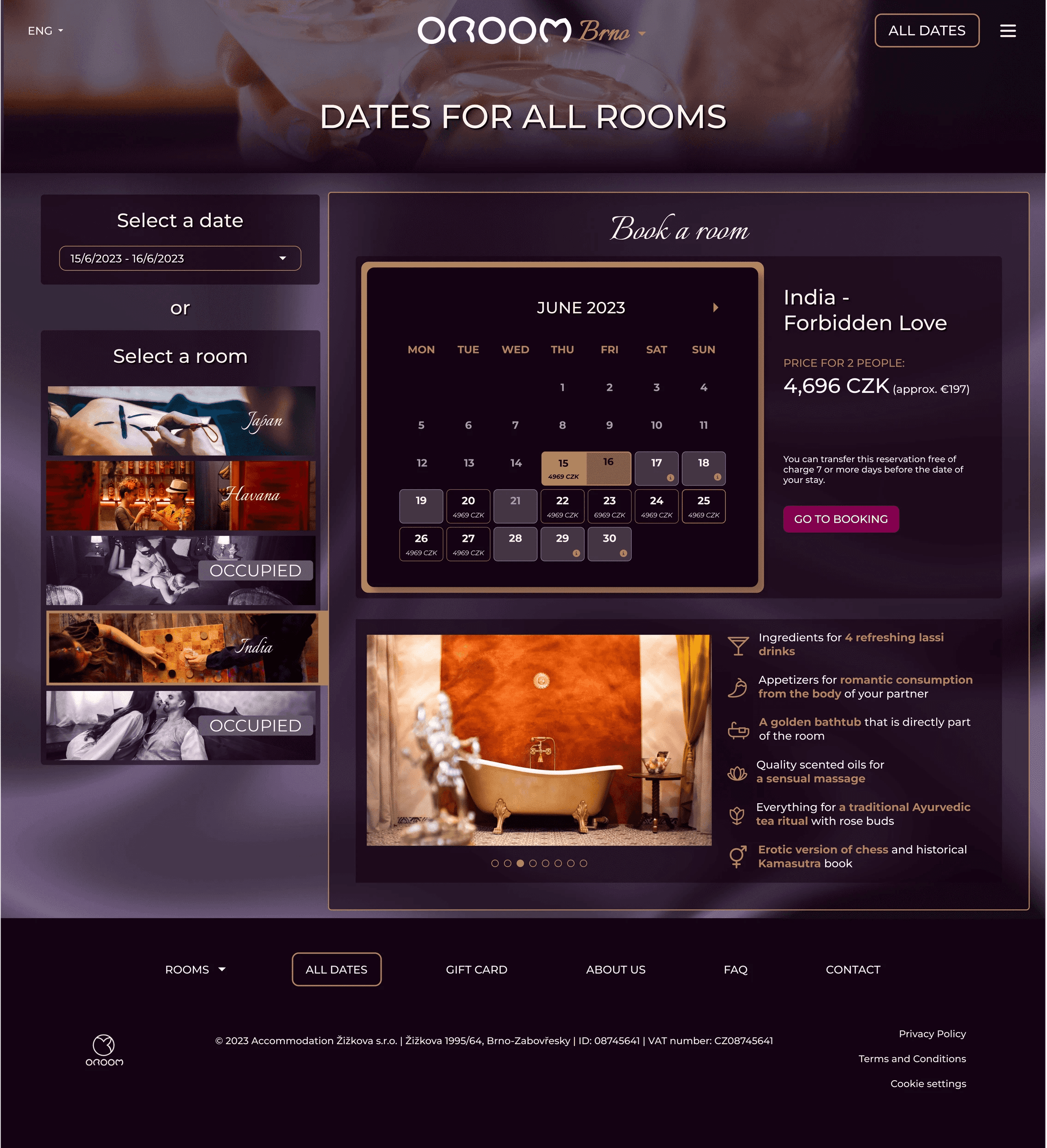
master calendar
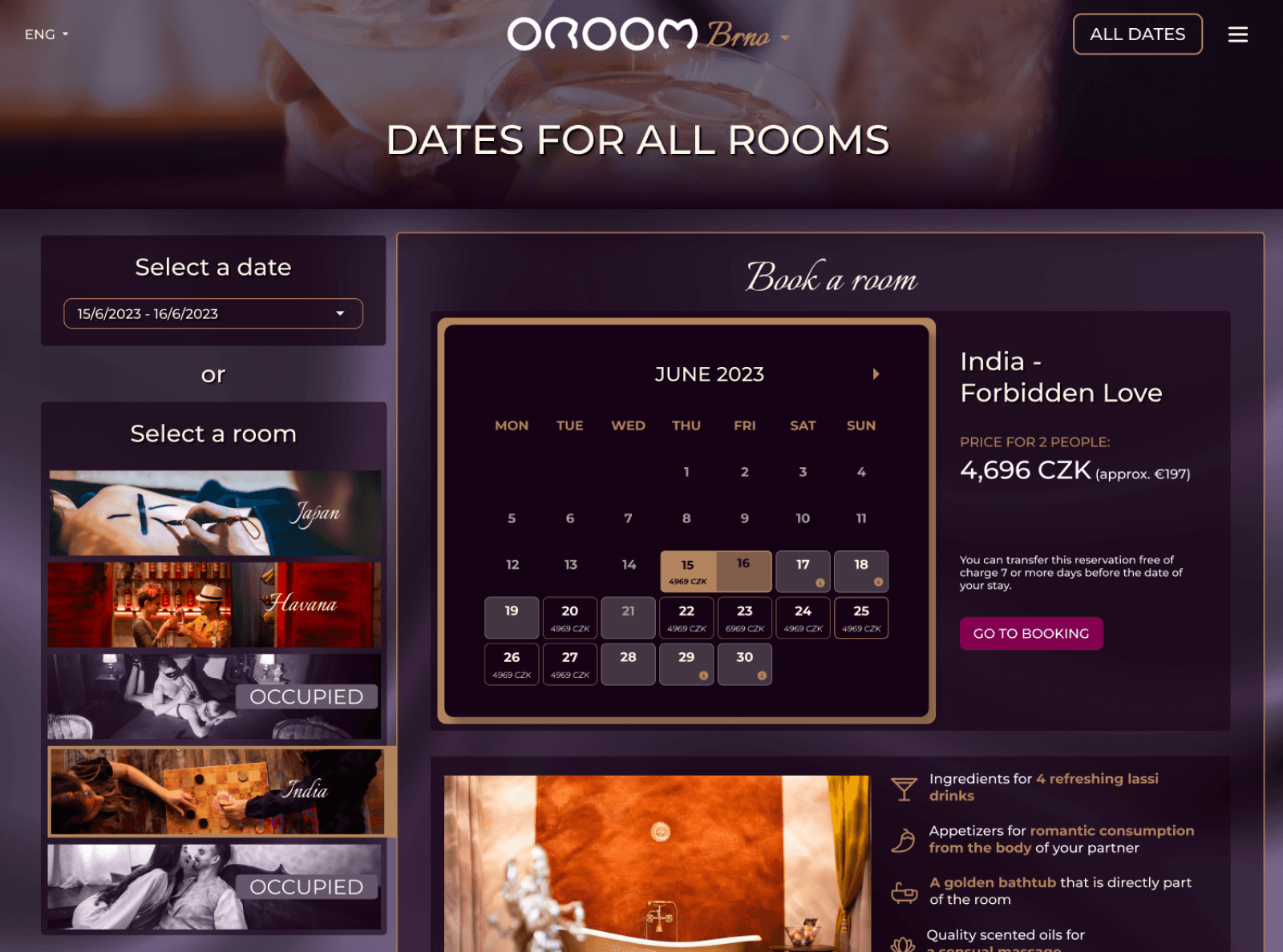
One page allowing visitors to see availability and descriptions of all rooms at the same time.
Scroll to explore
Scroll to explore

Research
Getting the team on board with the redesign
talking to stakeholders /
managing expectations
It was crucial to understand needs, goals and limitations on the stakeholders side.
CEO & Product Management
Setting up business goals
KPIs for measuring the success
Customer Service
Team
Current care of clients
Feedback collection process
Marketing team
(PPC & Content)
Key elements missing for effective communication
qualitative user interviews & sUrvey /
what's the added value for oroom customers?
I needed to explore clients' motivations for their visit and understand how current customers perceive OROOM and its unique features.
User type
Previous visitors
of OROOM
Interviews
10 in-person interviews
Survey
55 responses
Age Range
21-66
INTERVIEW INSIGHTS /
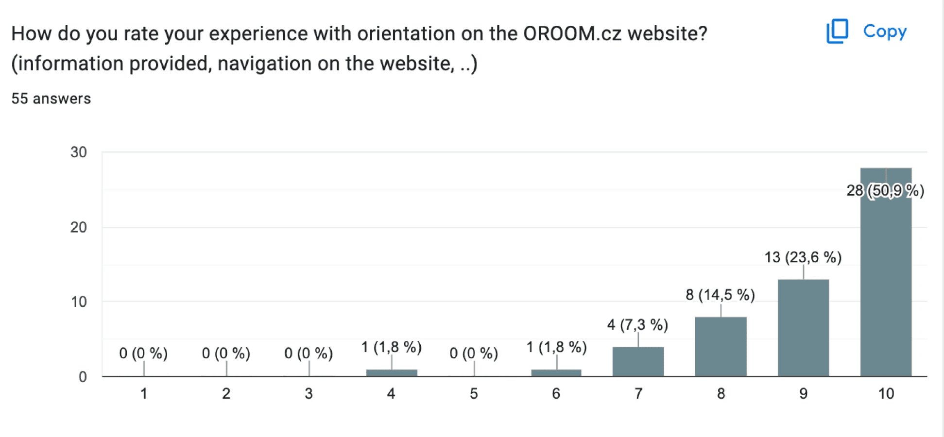
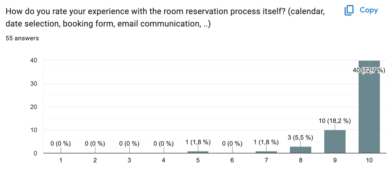
users familiar with the service left with enriched memories and find no issues with the website
Users were highly satisfied with their OROOM experience and didn't point out any drawbacks on the website itself. Broader survey data confirmed these findings.
Answers from the survey (55 answers)*
OROOM online /
I wanted to learn more about the current situation and how people perceive OROOM.
01 / the website heuristic evaluation
I identified several areas for improvement: the pages were too similar, contained repetitive information, had lengthy texts, and exhibited inconsistencies in UI elements.

Areas of long, dense texts


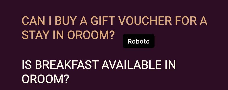
Variation of different font styles
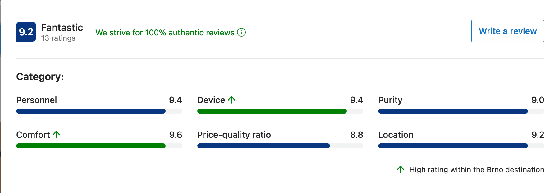
02 / OROOM ONLINE PRESence
Analyzing OROOM's platforms revealed overwhelmingly positive reviews with consistently high ratings.
Google Maps
Booking.com
initial monitored usability testing /
what new visitors think of the website?
I conducted initial usability testing and observed user interactions to identify pain points and gather feedback on design and its functionality.
User Type
People completely unfamiliar with
the concept of OROOM
Test sample
5 monitored testings in CZECH
(website’s native language)
5 monitores testing in ENGLISH
(secondary language)
usability testing insights /
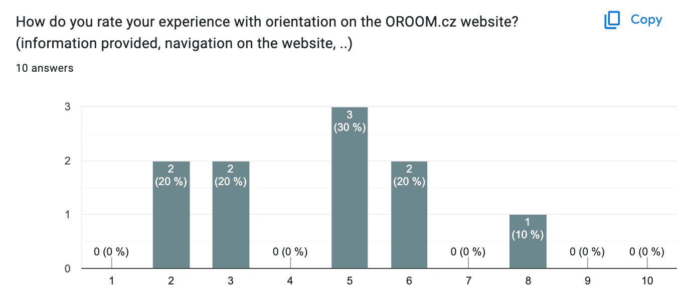
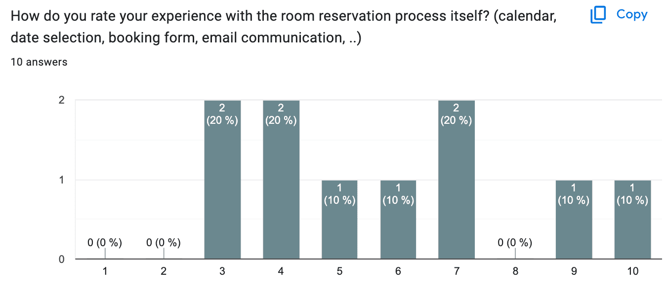
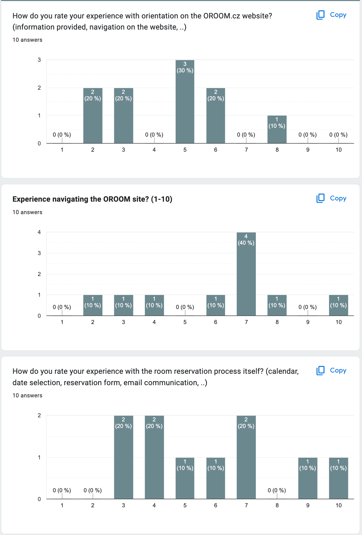
Confused about what OROOM offers
Answers from the monitored testing (10 answers)
data analysis /
how customers behave on the website?
Conversion Rate
0.25%
*calculated with limitations due to Cookie consent restrictions
Bounce rate
~90%
*slightly different on each page
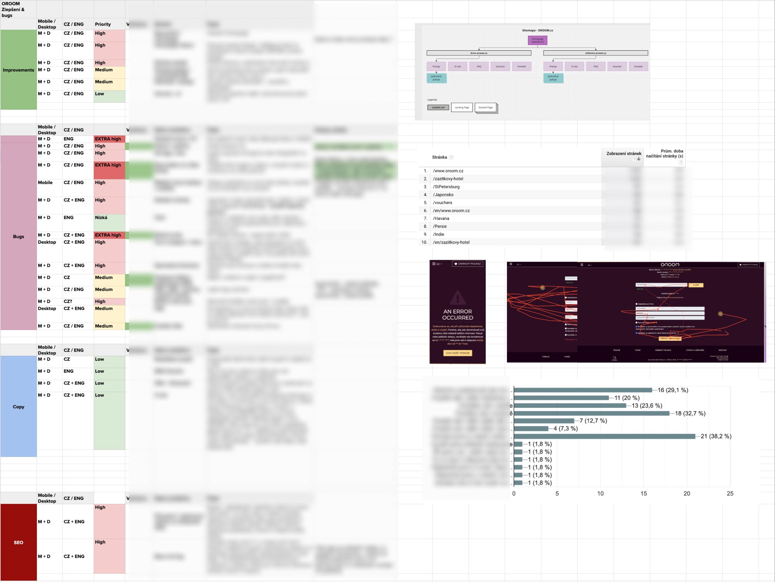
Tap to enlarge
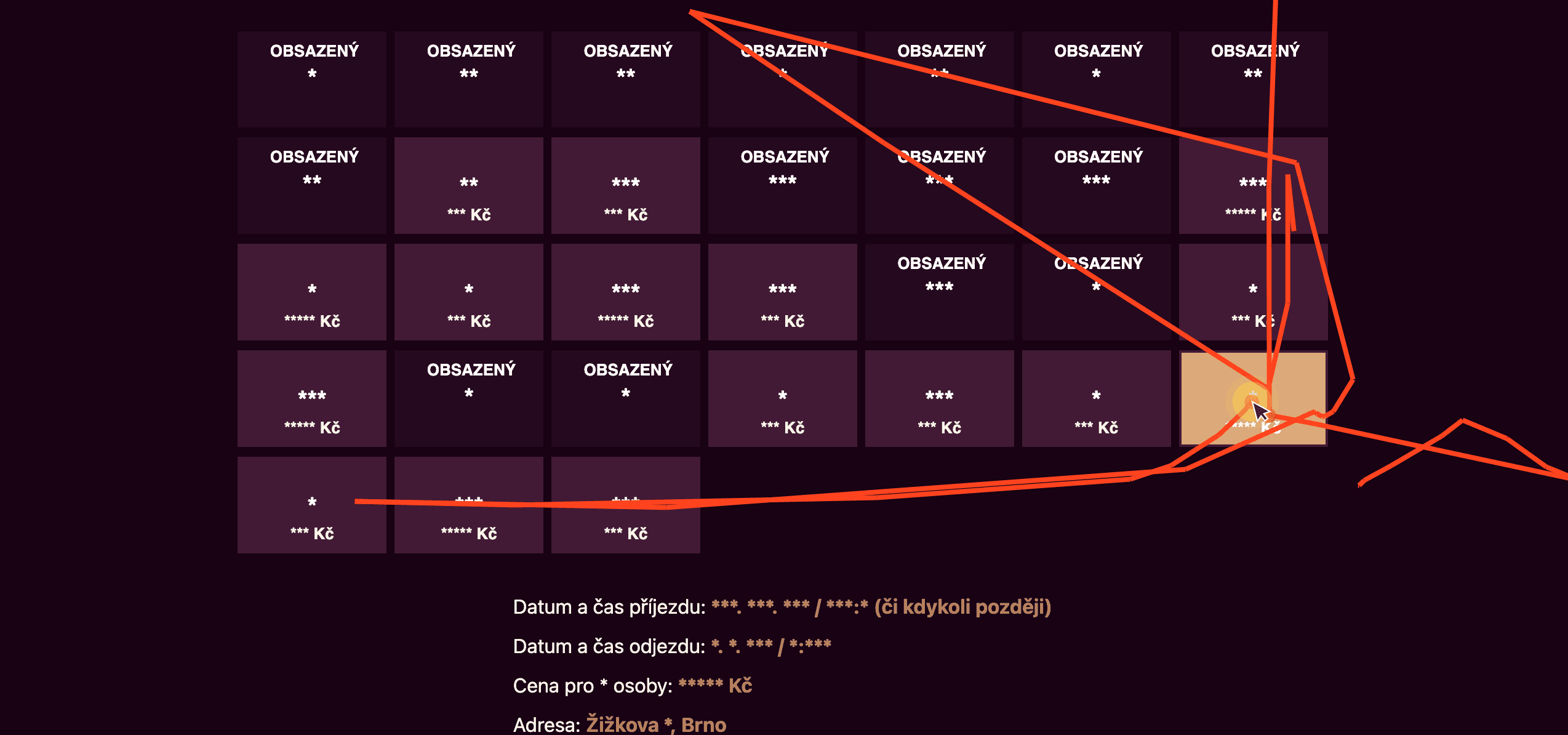
Snippet from Hotjar recordings: it allowed me to track visitors' paths and behavior on the website.
define
Prioritizing and focusing on main issues coming from research
main insight /
Visitors who recognize the added value of the experience are less likely to abandon the website immediately and are willing to pay a premium for their stay.
new discovery /
Visitors use ORoom as a mini escape to explore new cultures
Although the role-play storyline has been marketed as the main unique selling point since the business’s inception, visitors considered it more of a nice bonus. They view the experience as a special escape from reality, an opportunity to explore a particular culture, and a mini vacation.
Prioritisation of the issues /
I listed and categorized all identified issues
Tap to enlarge
01 / Uncertainty about the service
New visitors struggle to grasp the added value of the stay, perceiving the price as high and feeling of leaving the website quickly.
02 / Lack of Trustworthiness
Due to the website’s intimate nature users find it difficult to believe the business is legitimate, leading to skepticism and a lack of trust.
03 / Navigation Challenges
Users have difficulty with comparing room options and available dates, as well as navigating the site, which impedes quick decision-making.
the opportunities /
..help new visitors quickly understand the added value of the experience on the website?
..enhance the website’s trustworthiness and credibility to reassure visitors of the business’s legitimacy?
..improve site navigation and visual appeal to help clients quickly compare room options and make decisions?
features /
translate opportunities into actions
01 /
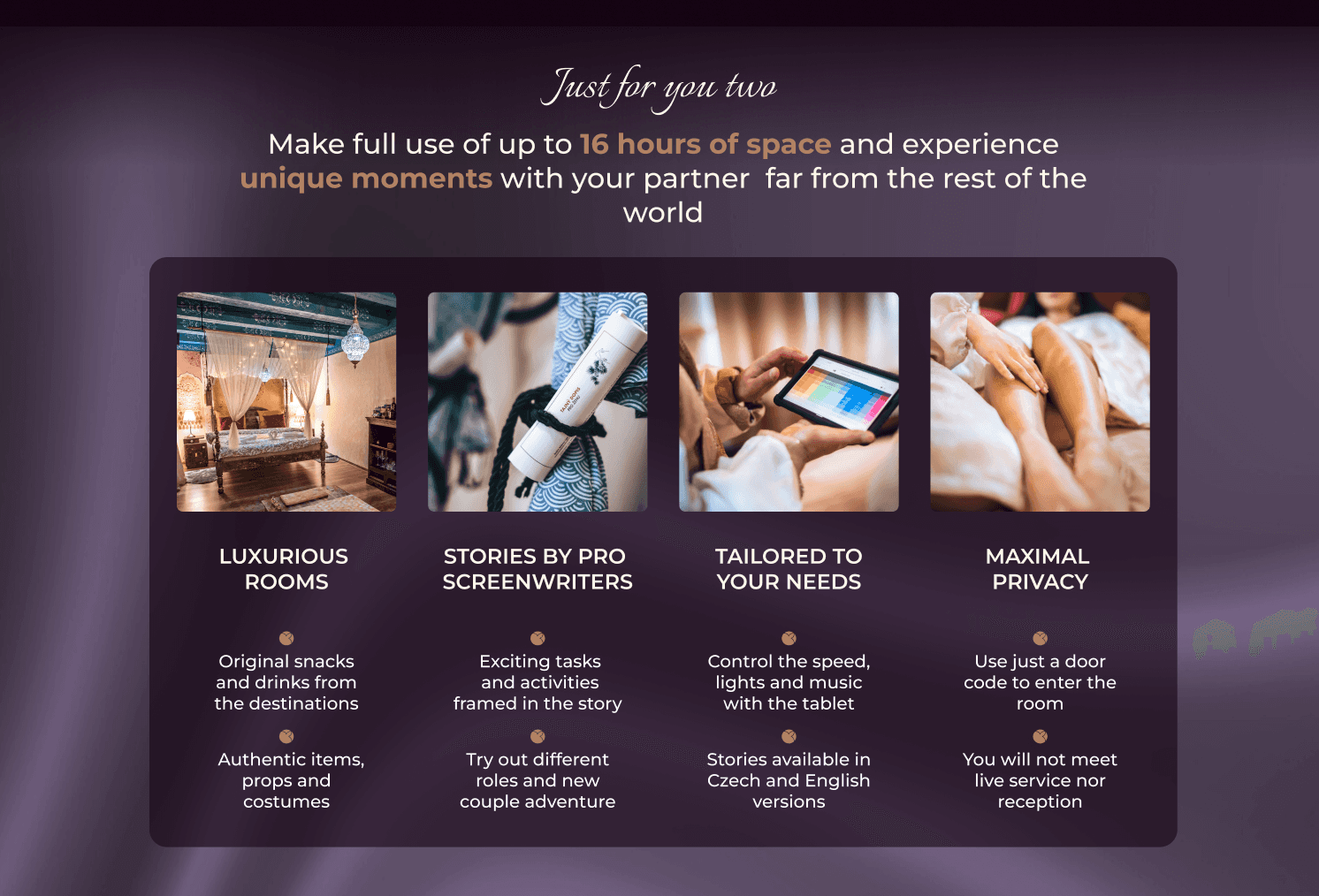
Prominent sections that clearly highlights the unique benefits and value of the experience.
02 /
Implement trust signals such as verified customer reviews in the suitable placements.
03/
An intuitive room comparison page with filters, side-by-side views for quick decision-making.
design
low-fidelity WIREFRAMES /
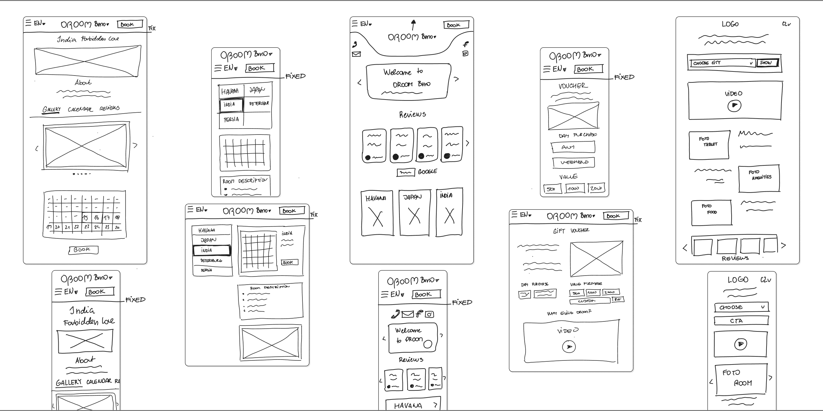
Hand sketches
At this phase, I create quick sketches of various ideas and concepts. These preliminary designs are not meant for stakeholder review but lay the groundwork for developing wireframes in Figma. They assist in structuring content and layout plans for subsequent screen designs.
design pivot /
a new franchise location needed to be incorporated into the current website
Tap to enlarge
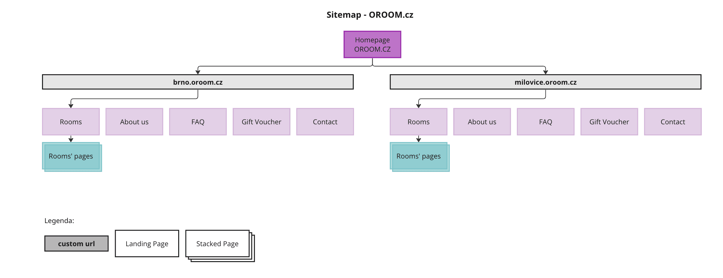
I urgently developed restructured the sitemap to streamline user flow and minimize clicks.
Tap to enlarge
FINAL DESIGNS /
Complete Redesign Focused on clarity and trust
01 /
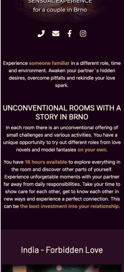
Explain of the unique service value
Problem:
challenging to quickly and fully grasp the offer
Excessive lengthy and dense texts.
Information not strategically placed and lacking a clear information hierarchy.
Added more service-describing photos.
Streamlined the process by condensing room information into shorter, boxed sections.
Before
After

02 /
Focus on trust-building elements
Problem:
questionable reputation if the business is even real
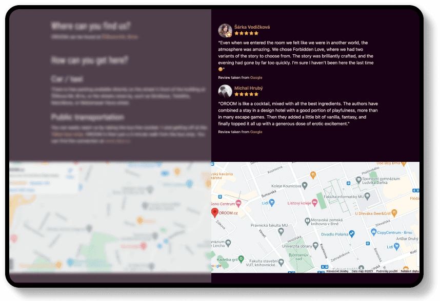
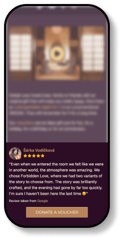
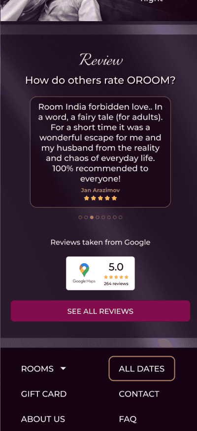
Reviews placed randomly in unexpected locations (e.g., contact page, FAQ).
Often repeating on different pages.
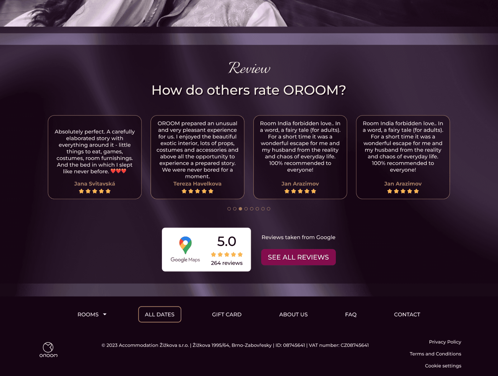
Reviews were consolidated into a single box on the homepage and each related room page.
Promoting the trustworthiness of the business with genuine, automatically integrated Google reviews & banner.
Before
After
03 /
Developing tool for easier room&dates comparison
Problem:
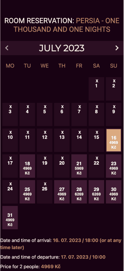
challenging to quickly see all availibilities
difficult decision making & completing purchases
Inability to view availability for all rooms simultaneously.
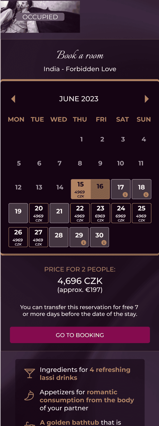
The main call-to-action leading to a gift voucher instead of booking a room.
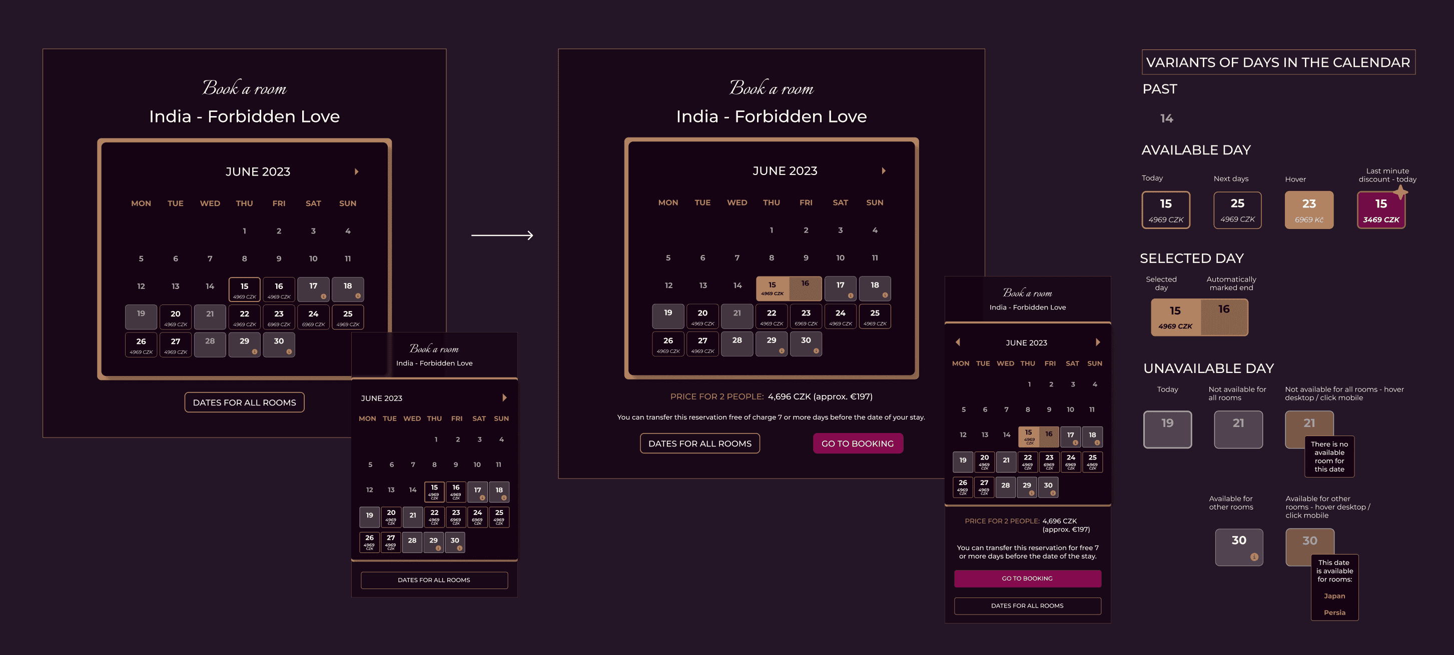
Created a master calendar that lets users select dates and switch between rooms' calendars with a single click, including room descriptions to facilitate easier comparison.
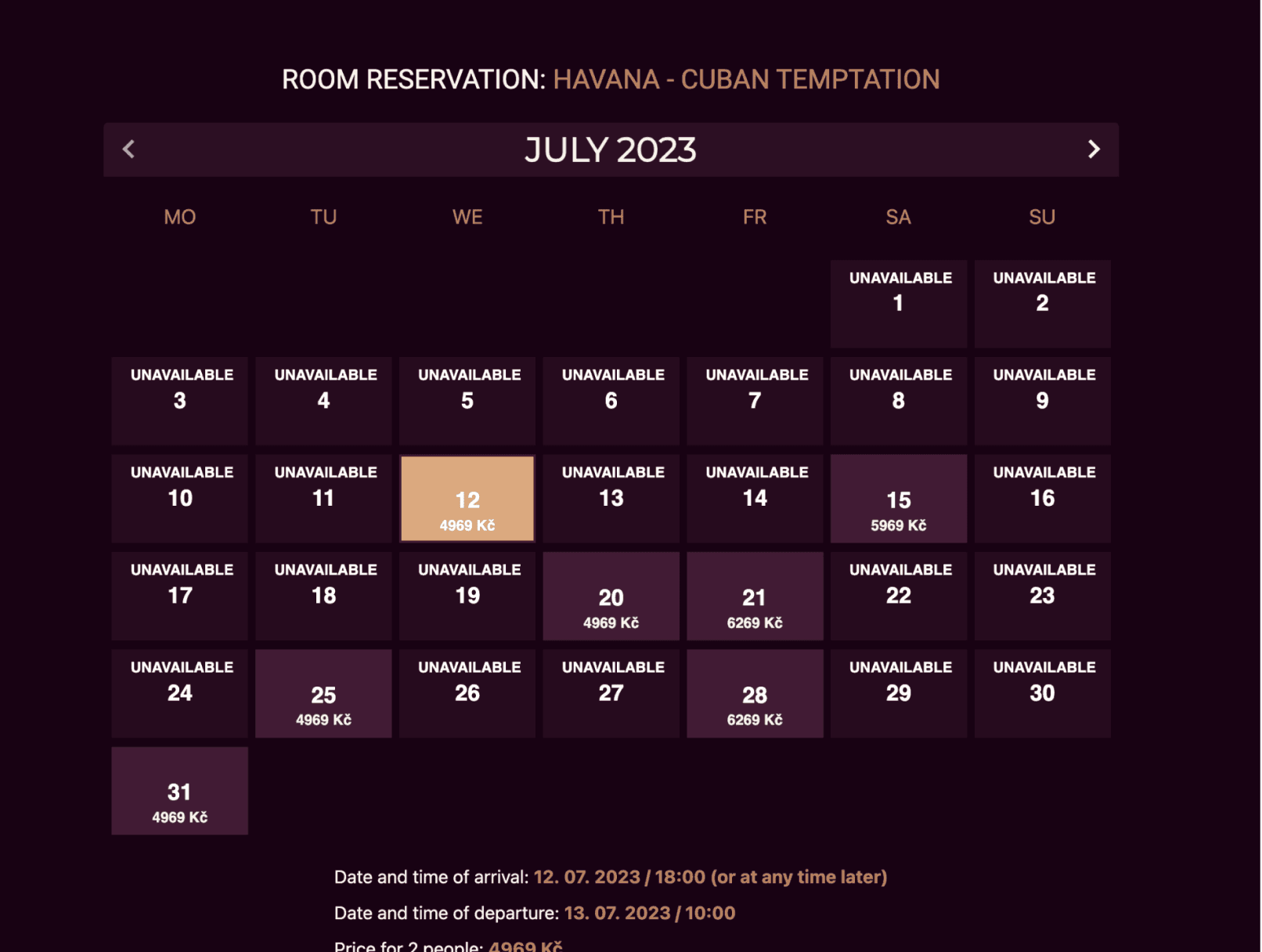
Redesigned the calendar with prominent last minute discount and implemented enhanced details for improved orientation.
Before
After
iterative testing
Let’s assess the redesigned website
Usability test /
did the clarity improve after the redesign?
I recruited new participants to assess the intuitiveness of three main flows on the updated website via Maze, simulating scenarios for new OROOM's clients from advertising.
In-person
2 monitored tests
Online
10 unmonitored tests
test results /
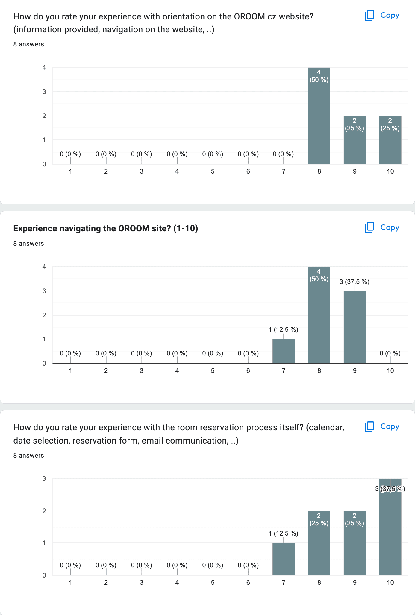
users easily grasped the service upon first glance without confusion
Pre-redesign
Post-redesign
4.5
8.8
8.3
8.9
6.1
5.8
setbacks /
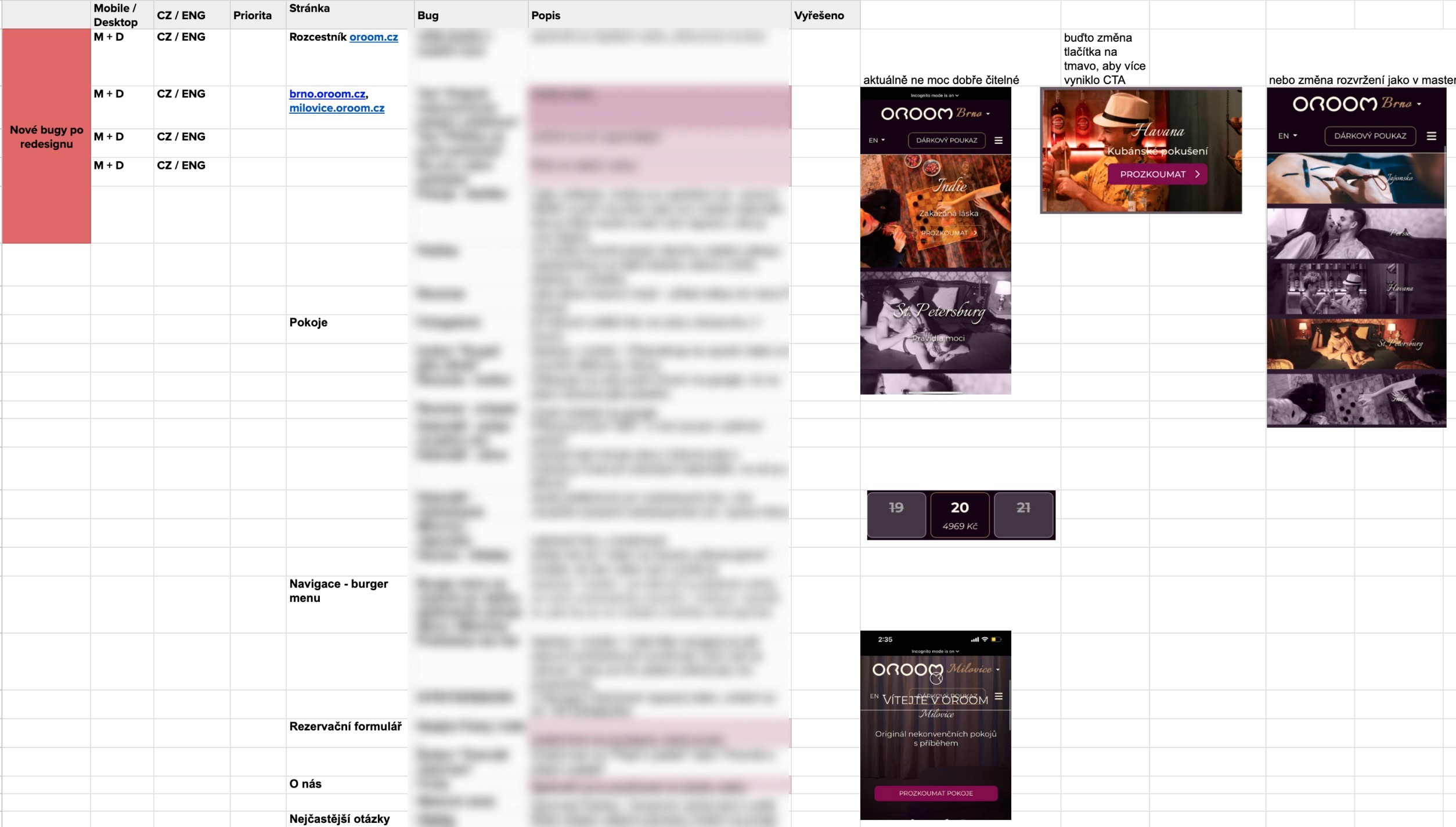
Minor bugs and unclear buttons needed attention
Tap to enlarge
iterations /
Main Button Visibility Enhancement
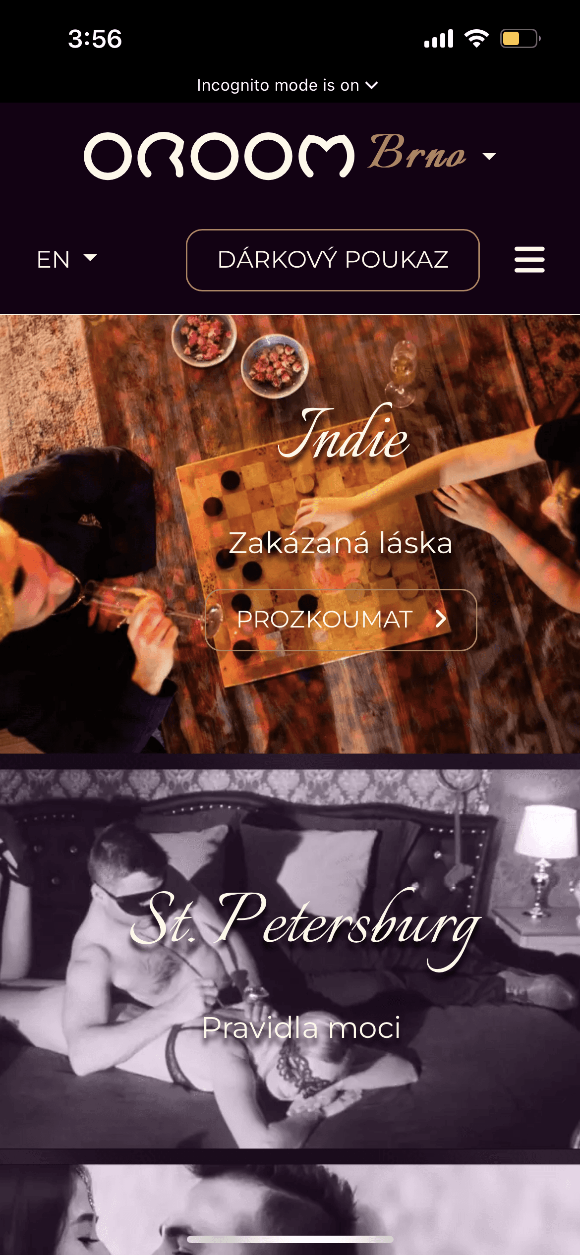
Due to discrepancies between the designed and built versions of the site, the main CTA needed to be made more prominent to ensure users don't overlook the option to click and explore room details.
Before
After
impact /
Did the redesign actually work for the business?
Time Periods
Before: February 1 – May 1, 2023
After: February 1 – May 1, 2024
With the consistent traffic–amount of visitors coming to the website–in both time periods, there were significant changes in:
Engagement Sessions
+44%
Sessions longer than 10 seconds or contained a conversion event or 2 or more screen or page views
Session with Engagement per User
+25%
The average number of sessions per active user in the selected period.
Initial Conversion Rate*
New Conversion Rate*
Increase of Conversion Rate
6.4x
*calculated with limitations due to Cookie consent restrictions
user's feedback /
real users noticed the difference
Additionally, we received positive feedback directly from customers that noticed the new
features incorporated into the calendar and website.
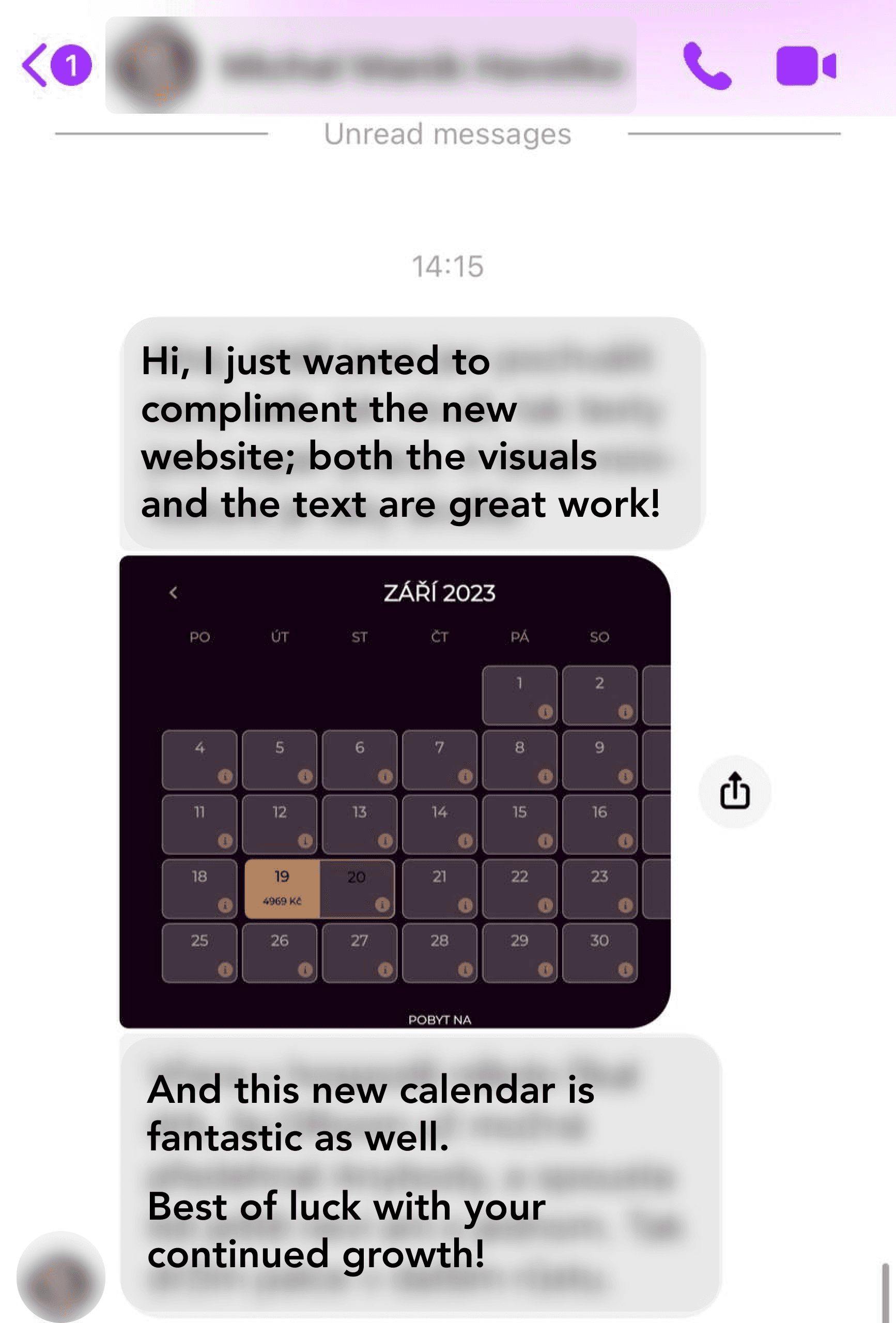
*Feedback was shared in Czech–native language of the website
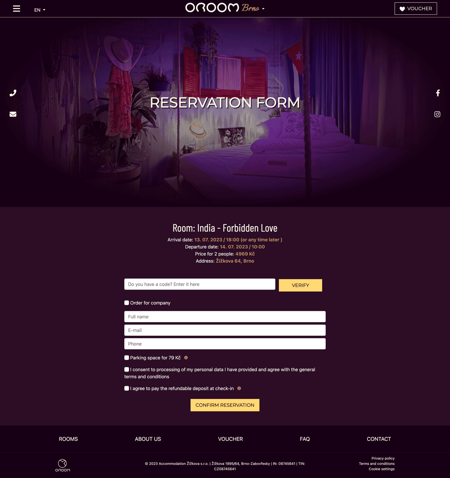
reservation form BEfore
Scroll to explore
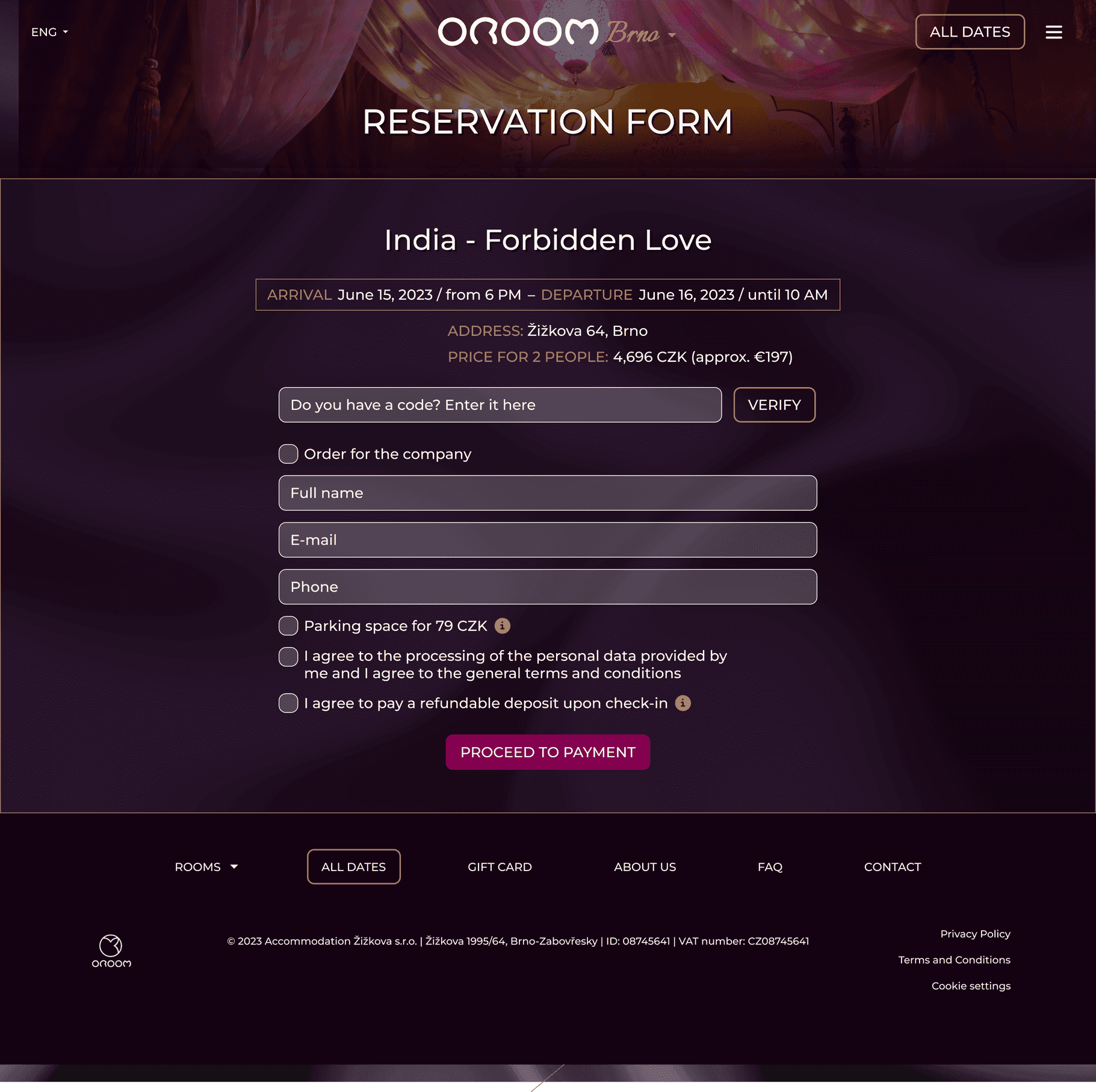
reservation form After
Scroll to explore
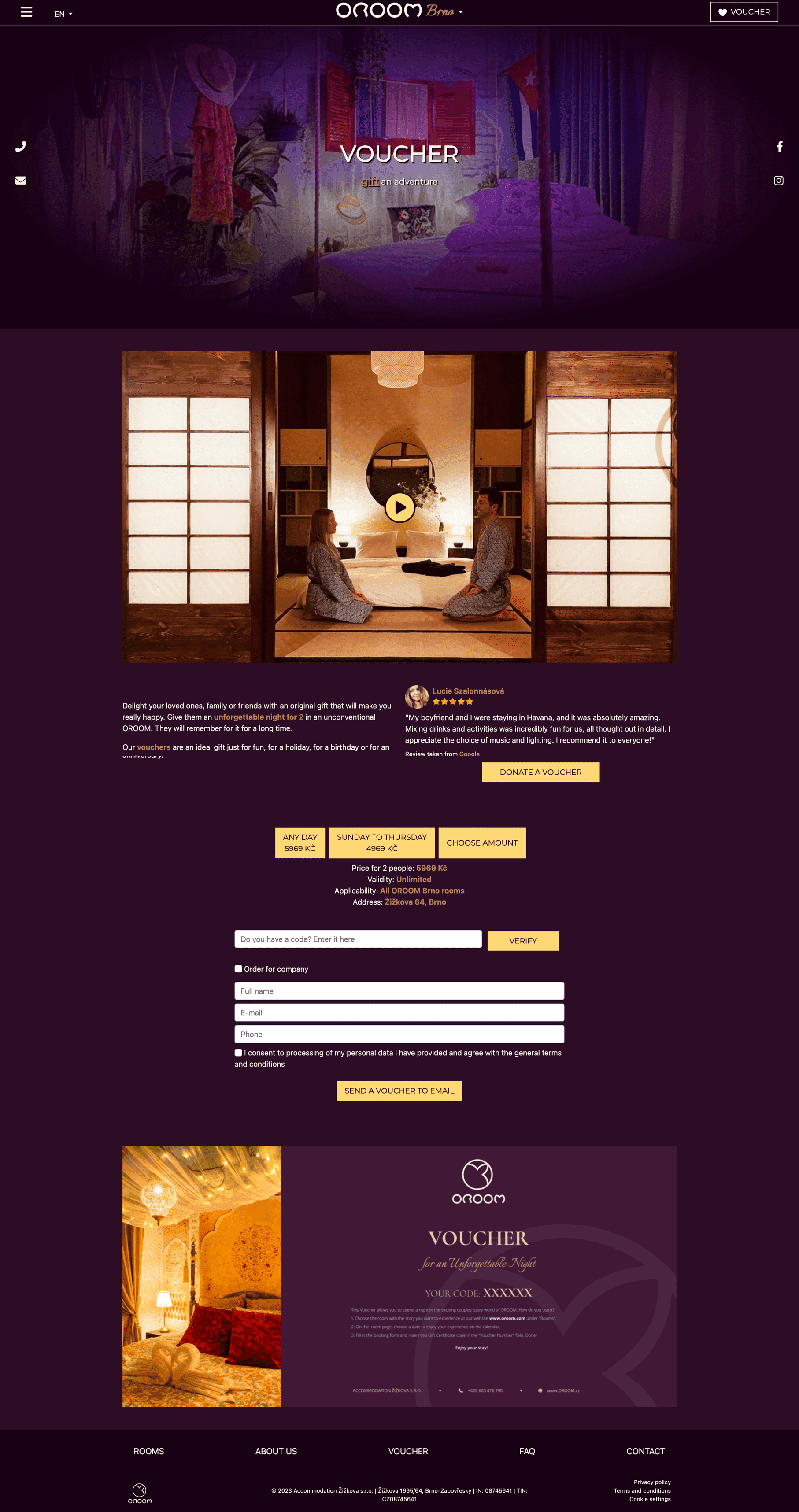
gift voucher BEfore
Scroll to explore
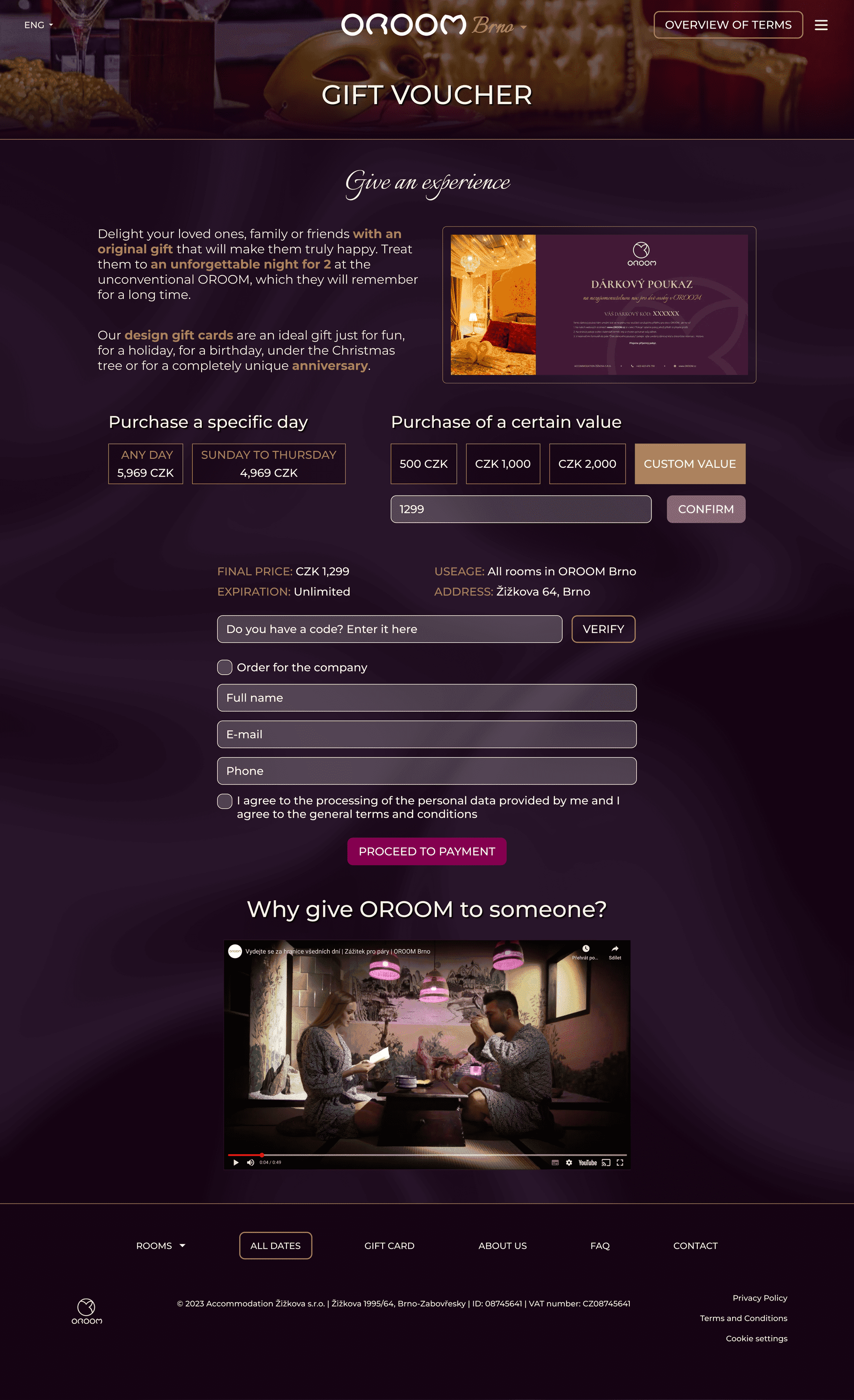
gift voucher After
Scroll to explore
next steps /
Master calendar in process
Since the redesign, OROOM has opened 2 additional locations, both of which have implemented the same website design.
The development of the master calendar has been postponed due to the extensive work required and the significant changes it would entail for the website. Given the improved conversion rates and sales, the CEO is currently more cautious about making substantial changes.
CHALLENGES and obstacles /
Introducing UX processes and advocating for it's importance
I faced challenges introducing UX processes and research in an environment where these methods were new. To overcome this, I focused on showing clear benefits, working closely with different teams, and adapting UX strategies to align with organizational goals.
LEARNING /
Identifying patterns earlier could save time
In future projects, I would rely more on identifying patterns in visitor feedback to streamline user research efforts. This approach would minimize the need for extensive in-person interviews and surveys, optimizing time and resources while still capturing valuable insights.
